Online store
While analyzing the brand, I learned that CROPP is part of the street fashion. The brand's extensive collections for men and women, complemented by a wide range of shoes and modern accessories, help customers create their own style. With this base, they can express emotions and push boundaries. Cropp draws inspiration from contemporary culture and music, creatively blending these design trends with fashion straight from the catwalks of the world. Cropp clients are people who follow the latest trends, but do not do it blindly, focusing on individuality and expressing a unique style. Therefore, the following colors were chosen for the color palette of the store: the main ones are white and black, to which the buyer is accustomed and they do not distract him from the choice of goods. As well as accents - light green and purple, which will well convey the mood of the brand. Light green color means overcoming all obstacles and liberation from the captivity of conservatism. He is a symbol of a breath of fresh air, freedom and the destruction of boundaries. Purple is a very rich and eye-catching shade of the color spectrum. It is born from a combination of blue and red, which are very bright in themselves. It is believed that only a sensual and freedom-loving person who is not afraid to show his individuality can decide on this shade in the image. Also, these colors are well combined and harmonize with each other.
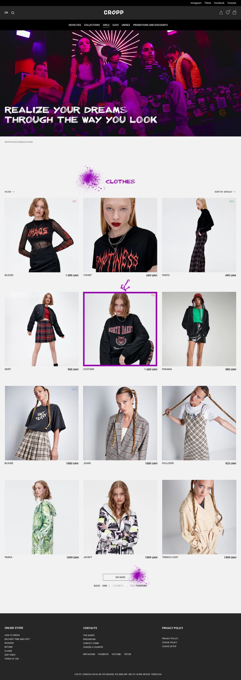
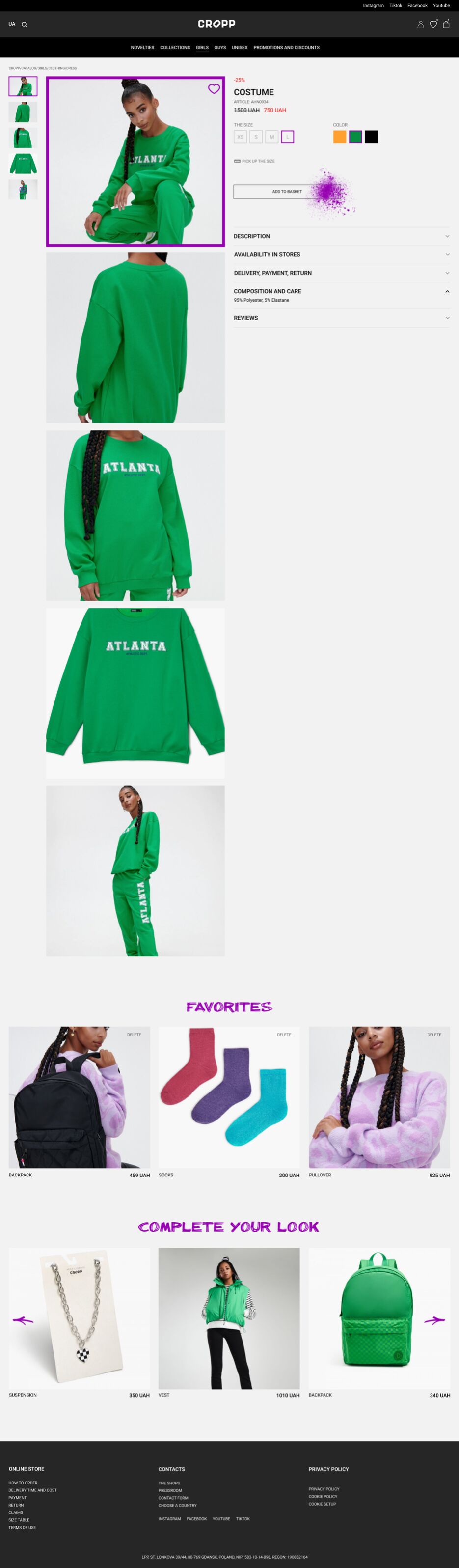
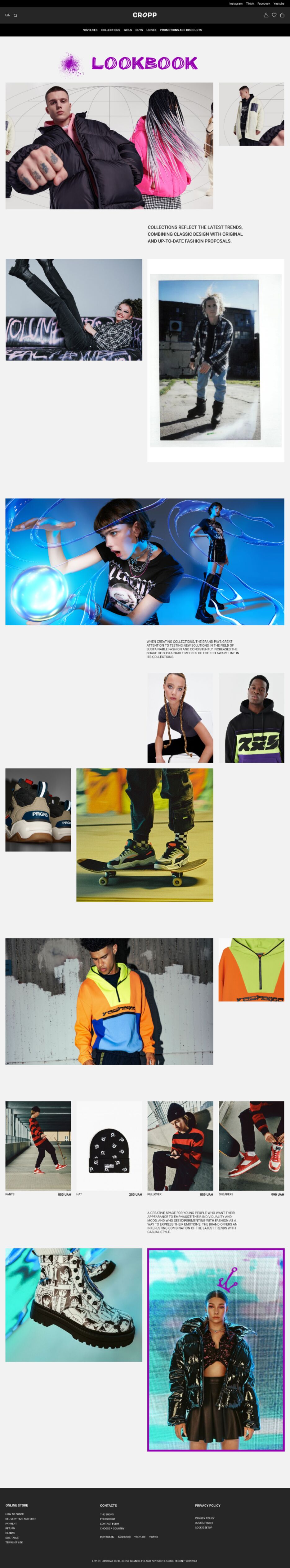
Street youth fashion, freedom and simplicity, a wide choice of models for any buyer - the content that I used speaks of this on every page. Bright and high-quality photos using clothes by ordinary guys also have a positive effect on the impression of the brand.
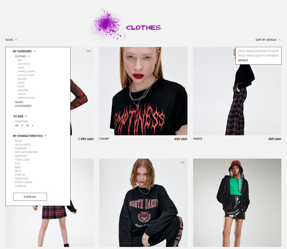
If we talk about working with the grid, here I used a 12-column grid. Convenient aspect ratio of product cards, ratio of photo sizes and typography; convenience and versatility of the grid when arranging content; within one screen, you can see a lot of products and have a good look at it without having to scroll a lot.
I made the headings on this site bright and accented due to just purple and light green colors, as well as an unusual billieBarred font. The main text of Roboto. The buttons on the site are also bright and non-standard, standing out against the background of other content and immediately visible to the user. They are accent colors with fill animation, and on the main page they are hand-drawn and custom-shaped. With this technique, I wanted to show freedom in expressing myself and my image, going beyond the limits of conservatism, since this is the USP of the brand. For each collection, as well as for men and women, unisex pages of their own style on which the user will definitely not get lost and will intuitively know where he is.
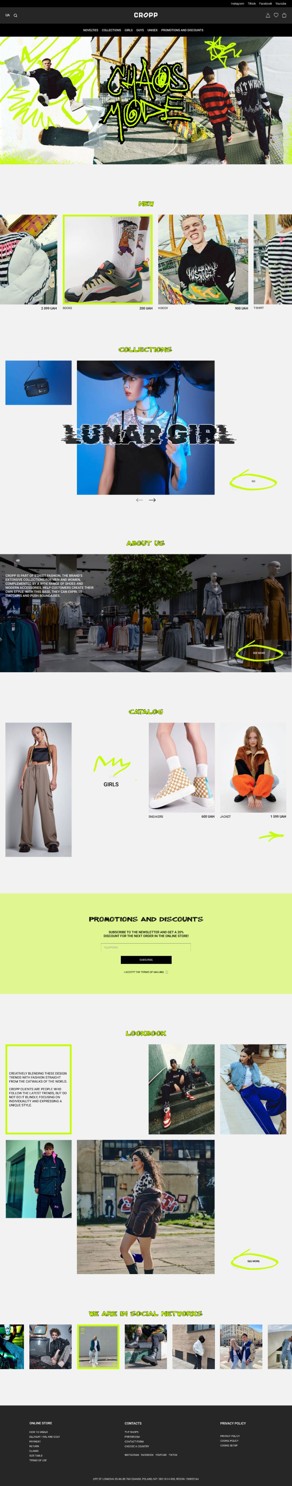
First of all, I would like to talk about the design of the main page: here I used more complex compositional solutions, because I wanted to make each block individual, unlike the other. To reveal the brand in this way and show the very freedom, individuality and uniqueness. After doing the research, I noticed that often the main pages of online stores are similar to each other: as a rule, these are some kind of large banners and several blocks demonstrating products (for example, blocks with new and popular products). And the main page does not attract the user at all, does not convey the personality of the brand. Therefore, I added such blocks as Collections, About Us, Catalog, Discounts, Look Book and Social Networks. I slightly changed the top filtering to make it more understandable for the user - I divided it into categories such as: for guys, girls, unisex, collections, discounts. Also, the buttons, slider and hover animation elements in some blocks were hand-drawn (bright lime color). This allowed to give the brand individuality and uniqueness.
1 The first thing the user sees on the page is a bright and juicy banner that attracts him and keeps him on the page.
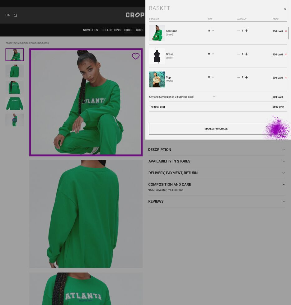
2 Next is the New section in which I placed 4 cards in a row with only important information: about the name of the product and the price. When you hover over the card, a bright green stroke appears, which makes it clear what exactly the user has selected and that the site interacts with the user - gives a response to his actions. You can also scroll through the cards with a slider to the right or left to see more or click on the title and go to the page of new products. It is also possible to click on the card and go to the product page and make a purchase.
Next comes the Collections block - in which I used a slider to allow the user to move to the desired collection. Juicy photos with an accent title in the style of a particular collection - to attract the user's attention. A bright accent button that stands out against the background of the content. All this together should cause interest to press the button and go to the collection page.
Next comes the About us block - simple and understandable, with photos and text information so that our user can get acquainted with the history of the brand, the production process and, if desired, can press a button and read more.