Corporate website
CULT - Creative creative agency with a reputation for innovative, culturally sensitive campaigns that re-solve old problems for fashion, beauty and luxury brands. The following tasks stood before me:
make the site logical, thoughtful and structured. So that the user on the site clearly understands where the block is and where to find the necessary information. How to leave an application for cooperation or order a project. And of course, I wanted to stylistically diversify the site, make it more individual and memorable. Especially since this is a creative creative agency;
since it is still a corporate site - it was necessary to take into account the needs of three CAs at once: users, partners and people who would like to work in the agency. The site should present the agency's services, show the value and benefits of these services for clients and partners. Also demonstrate the advantages of working with the company and popularize the work of the agency;
rid the site of template solutions. Stylistics: I used a large font for the headings - to visually enhance and reinforce the sense of scale and high status of the agency in the market. Accent headings also allow the user to quickly go through key information and stop at the block where the information is most interesting to him. All media content is of good quality. The replacement of the grid made it possible to use more complex and interesting compositional solutions. As for the colors, I used black, white and purple: black as a background color - it does not interfere with reading information and learning media content, white - for text and graphic elements, and purple - accent - for titles, buttons and interactive elements.
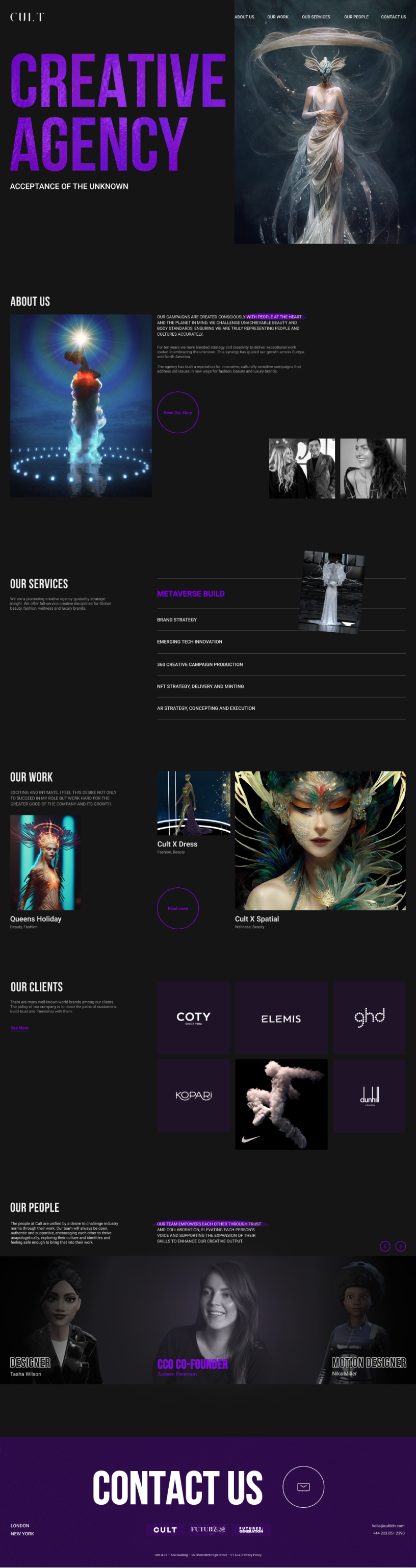
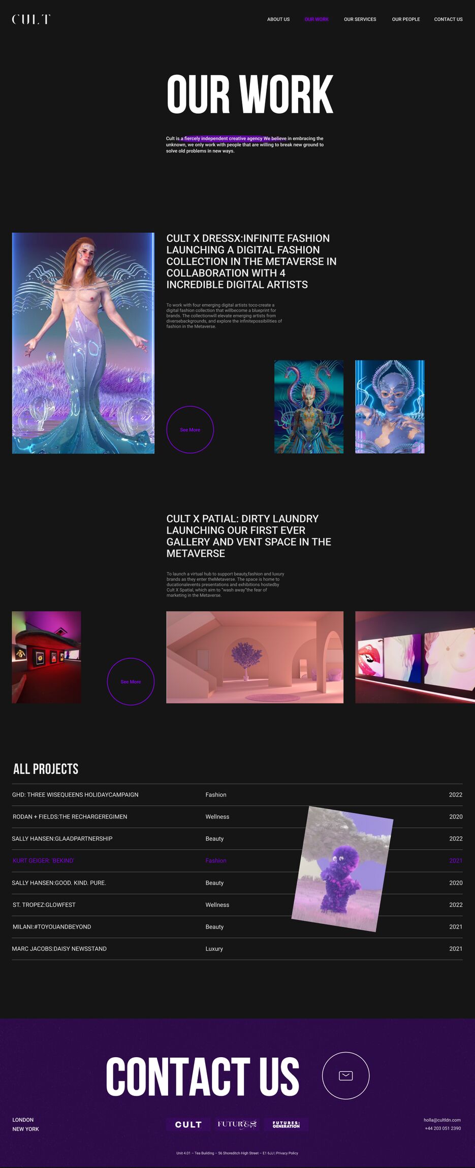
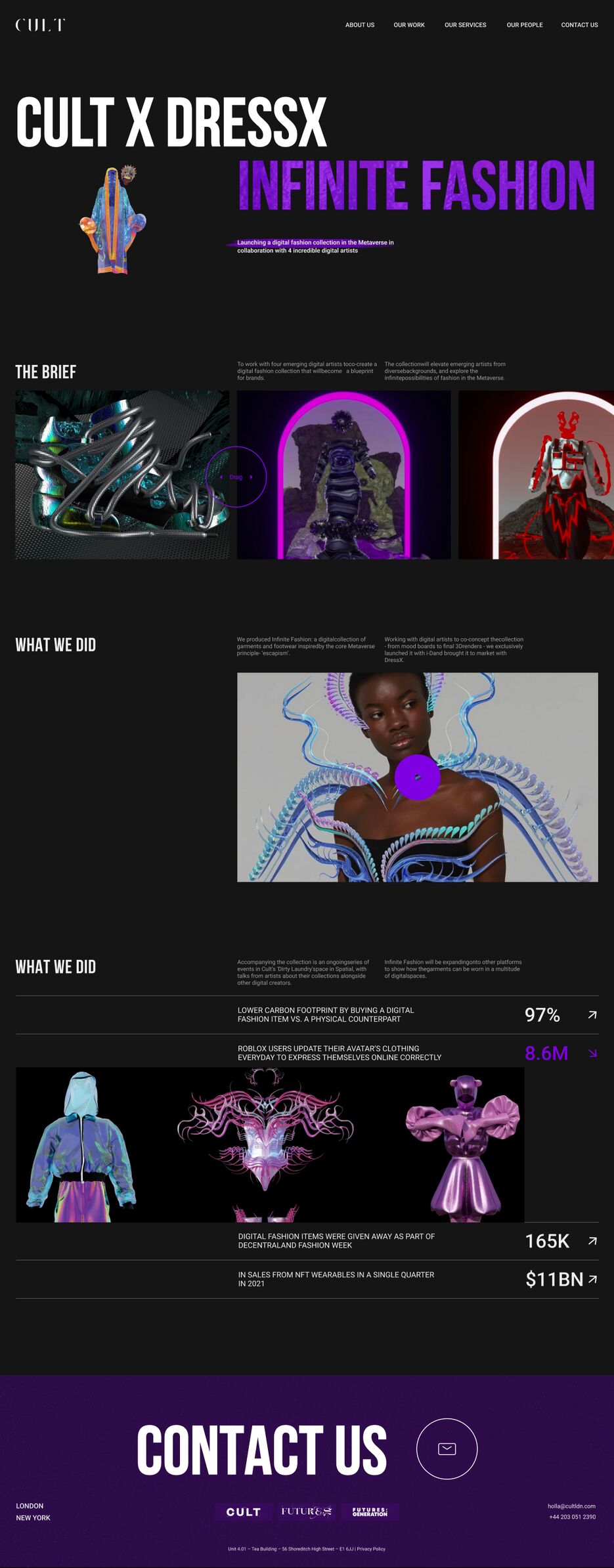
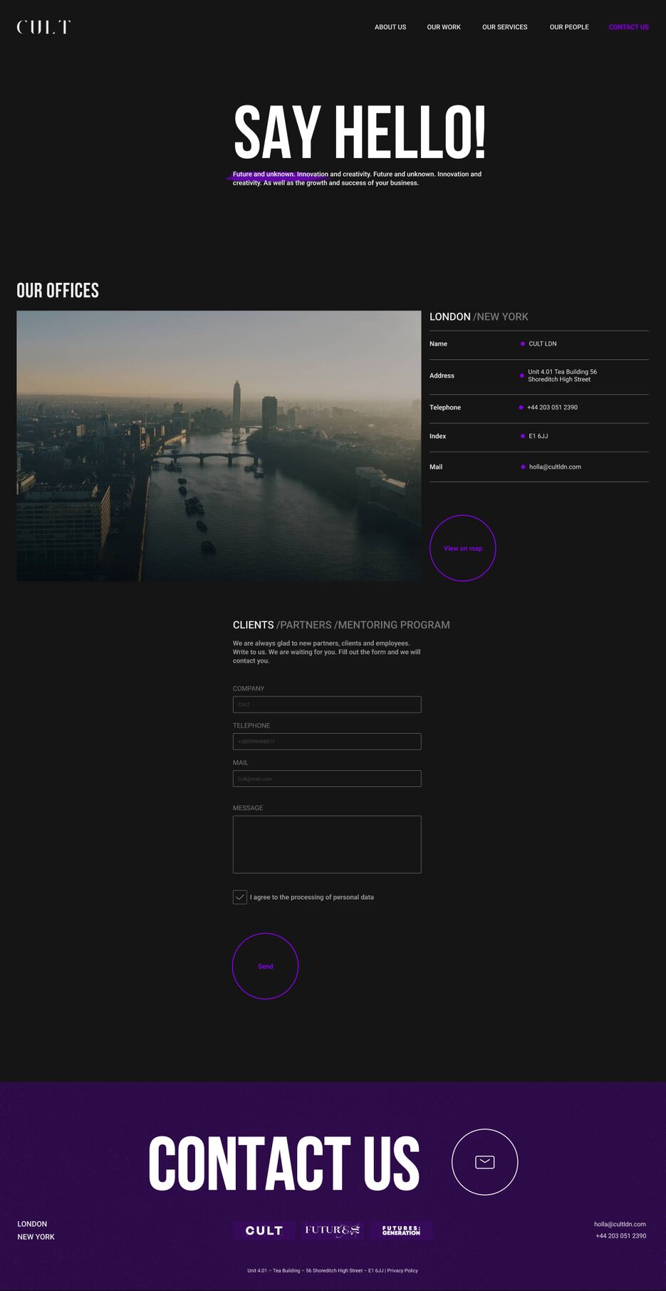
The main page begins with the "Cover" on which we see: a large headline and a bright photo of one of the projects. This immediately makes clear to the user the clear positioning of the agency. It also speaks of reliability and prompts to study the necessary information on the site and order the service. Next, I placed the block "About the company" - where I disclosed information about its activities, values and corporate culture. Showed the minimum necessary information and high-quality photo content that interests the user and encourages him to click the button and go to the "About the company" page to study the information in more detail. Next is the block "Our services" - information about the services provided by the company, I have placed in the form of an interactive table: when hovering over the service, the user can see a photo of one of the projects of this service. This will enable the user not to waste time searching for this information and to receive it in a convenient format in a compact, single block. Block "Our work" - here are shown the three most significant projects implemented by the agency, it shows the result of the agency's work and strengthens the desire for cooperation. They are presented in the form of cards with a bright and high-quality photo from the project and a short description. Clicking on one of them will take you to the page of a specific project, where you can get to know it in more detail. Or click on the "Read more" button and go to the project page to study the project that interests you the most. Block "Our clients" - shows clients with whom the company had experience of cooperation. The block shows six significant international clients, but you can see even more clients by clicking on the "Read more" buttons. This information strengthens the positive opinion and trust in the agency. Block "Our team" - gives the user the opportunity to get to know the agency's employees. The information that I have presented in this block indicates that talented people and highly qualified specialists work here. I presented it in the form of a slider for the user's convenience, by scrolling you can get to know the employee and see who will be responsible for the future project. This will once again strengthen the credibility of the agency. A footer with contacts and feedback completes the page. The information in this block tells the client that he can contact the company at any time, even if he decides to return to some block and study the information again. For example, go to the "Projects page" to find the project he needs and study it in more detail. This page begins with a cover page, which includes a title in bold font, as well as a brief description of the positioning of your work. Scrolling down, the user sees a block with 2 new projects. Here, I used interesting non-standard compositional solutions so that the client would get aesthetic pleasure while studying the content and not be bored while on the page and reading the necessary information. For each project, there is a button that can be clicked to go to the project page and learn more. I placed all other projects in the form of a structured and simple table, in which you can find the desired project and go to its page. The table contains information about the type of service, name and date of completion of the project. For convenience and better perception, the table was made interactive - when hovering over the project names, the client sees a photo from the project, which already gives the first impression of it. This page lets the user understand what result he will get if he contacts this agency. After going to the project page, the user sees the cover, which shows a large accent title (project name), a short description and a photo of the project. Next, for a detailed study of the work on the project, I presented such a block as "Brief", which presents the sketches of digital artists, which were used to create a fashion collection in the metaverse in the form of a slider for convenient and quick exploration of the content by clients. The "What we did" block consists of a text description and a video player for viewing the fashion collection. Next, you can familiarize yourself with the positive changes for customers after the release of the project. I presented these data in a table for easy user interaction with the content.
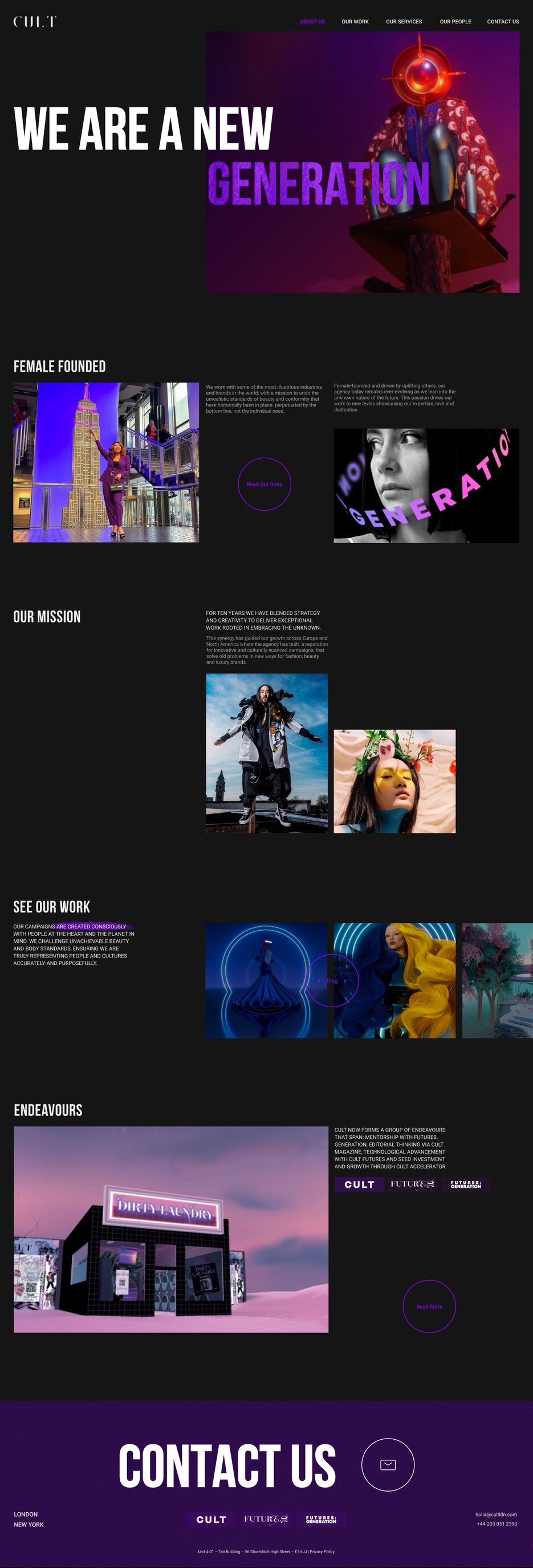
On the "About Us" page, we see an atmospheric cover with an inspiring title and a creative image - in this way, the user immerses himself in the mood of